Drift Fest

SERVICES
Rebrand
Marketing Collateral
YEAR
2026
INFO
Drift Fest is a celebration of speed skill and adrenaline that brings together drift enthusiasts professional drivers and fans for an electrifying experience on and off the track. More than just a motorsport event Drift Fest embodies passion community and the art of controlled chaos.

PROBLEM
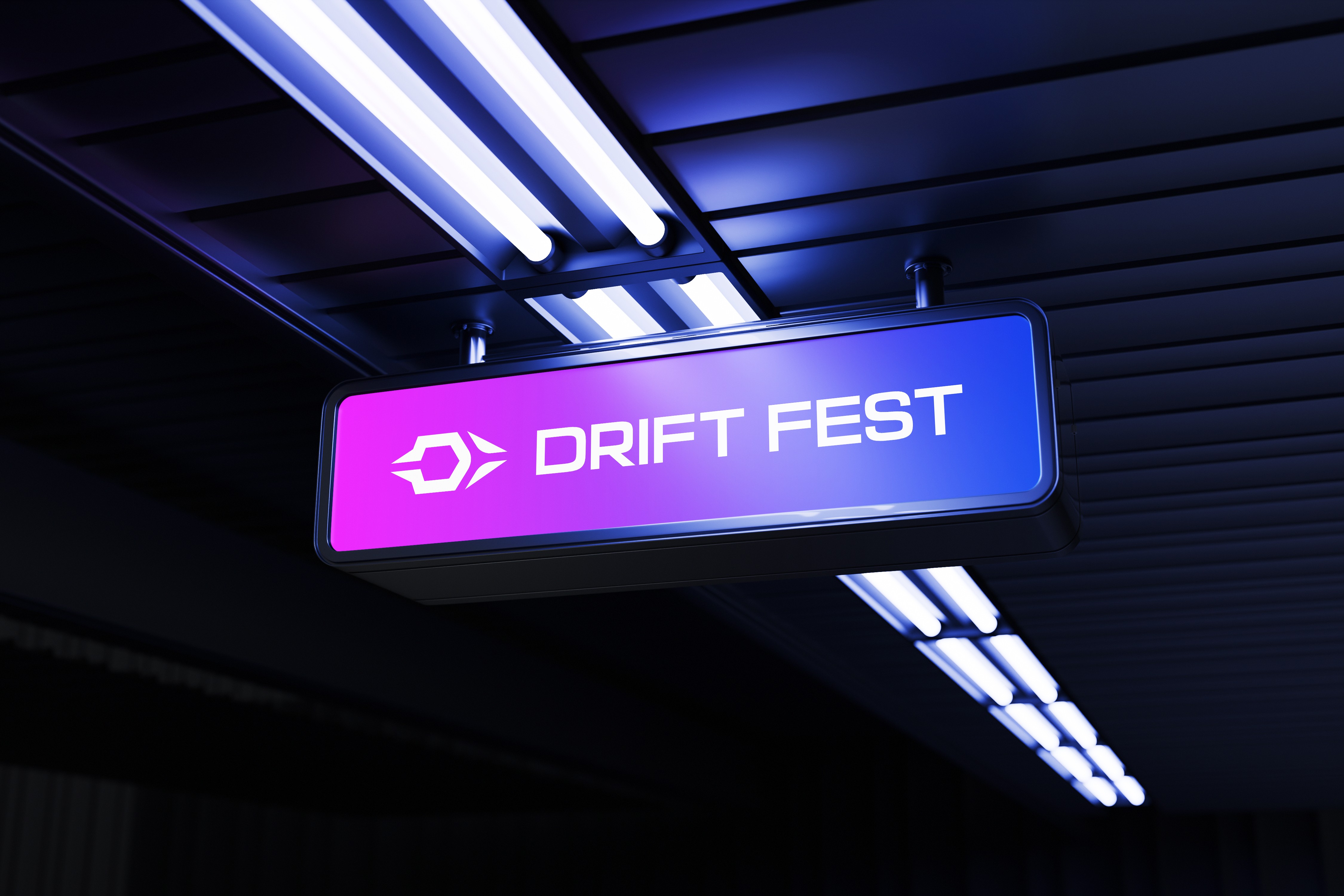
Use of various colors, shades, and highlights makes it unprofessional with a mundane look. There's no need to incorporate an outline around the logo. The logo lacks a brand mark and meaningful design; it is merely a font without any distinctive characteristics to make it stand out. They use this logo as a primary, secondary, and even brand mark, with no proper logo variations to employ on different brand touchpoints. It is not legible when scaled down.

SOLUTION
To solve these issues, I removed the unnecessary elements like shadows, highlights, gradients and built the mark around a clear concept, ensuring it’s meaningful and scalable. The typography is now harmonious, with all elements working together for a clean, professional look. I used the brand’s initial letters, D and F. I did not use the vertical bar of the letter F. Between the letters D and S, there is a three-spoke wheel in the negative space. Overall it’s a bold, distinctive, and timeless design conveying speed, energy, and passion to attract the car enthusiasts.